Variable UI Elements
Complete reference for all variable input types and their configuration options.
Overview
Each variable can optionally specify an input property that determines what UI control is rendered. If not specified, the input type is given a smart default based on the type. You can override the default by explicitly setting input to match your intended use case.

One of every input type below, rendered together in a single variables strip.
Input Types
select - Single Choice Dropdown
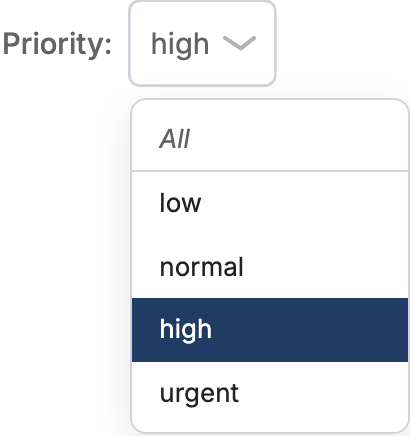
Renders a dropdown menu allowing users to select one option from a list.
Value shape: string
Configuration:
variables:
  region:
    input: select
    options:
      static: [North, South, East, West]
    # Optional:
    default: North  # Initial selection
    placeholder: "Select a region..."
Options Source:
- options.static: Array of static values, all strings or all numbers
- options.query: Reference to a query that returns options
- column: Automatically populated from column values
Value type. The browser sends a chosen option back as text, and the value
has to reach SQL with the column's type: BigQuery and Trino refuse to compare
an integer column with a string. A numeric options.static list types the
value as a number by itself. When the options come from a query, say what
they are with data_type: number or data_type: date (a date-typed choice
then compares the column as a date, like a date input). Without it, a
query-driven option is a string.
variables:
  year:
    input: select
    options:
      query: years
    data_type: number
Select controls render the options you provide. dbt Charts does not add an "All" option to that list automatically. An unset select is already no filter (filter() emits 1=1), so the usual all/no-filter choice is to leave the variable unset. A non-required select's open menu shows an italic clear-selection row above a divider (see the screenshot above) — labeled All unless the variable sets a placeholder:, in which case that text is used instead. It's a clear-selection affordance, not an authored option; picking it unsets the variable rather than sending a literal "All" value to your query. If you author an explicit option for it, give it the same type as the others: a list mixing numbers and words ([2023, 2024, All]) is refused, because the list is what types the value the control sends back.
Example:
variables:
  priority:
    column: dundersign.tickets.priority
    input: select
    # Options auto-populated from column
multiselect - Multiple Choice Dropdown
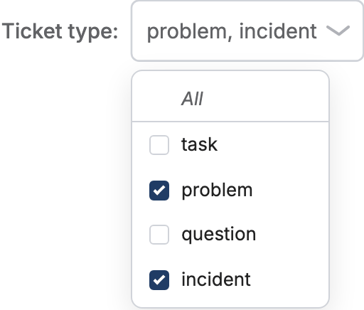
Renders a dropdown menu allowing users to select multiple options.
Value shape: array / string[]
Configuration:
variables:
  regions:
    input: multiselect
    options:
      static: [North, South, East, West]
    # Optional:
    default: [North, South]  # Initial selections
Usage in Filters:
When using multiselect variables with the filter() macro, use the IN operator:
variables:
  priorities:
    input: multiselect
    options:
      static: [low, normal, high, urgent]
queries:
  tickets:
    sql: |
      SELECT * FROM dundersign.tickets
      WHERE {{ filter('priority', priorities, 'IN') }}
    source: my_postgres
input / text - Text Input
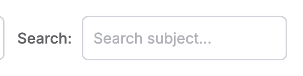
Renders a single-line text input field for free-form text entry.
Value shape: string
Configuration:
variables:
  search_term:
    input: text  # or 'input'
    placeholder: "Enter search term..."
    # Optional:
    default: ""
Example:
variables:
  product_name:
    input: text
    placeholder: "Search products..."
textarea - Multi-line Text Input
Renders a multi-line text area for longer text input.

Note: textarea currently renders as the same single-line field as
text; there is no multi-line box in the variables strip yet.
Value shape: string
Configuration:
variables:
  notes:
    input: textarea
    placeholder: "Enter notes..."
    # Optional:
    default: ""
number - Numeric Input
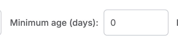
Renders a numeric input field with optional min/max/step constraints.
Value shape: number
Configuration:
variables:
  min_revenue:
    input: number
    # Optional bounds, enforced when a value is committed: one past min or max
    # lands on the bound, and one off the step grid lands on the nearest step.
    min: 0
    max: 1000000
    step: 100
    # Optional hint, shown muted while the field is empty. A default fills the
    # field, so the two are not used together.
    placeholder: "Enter minimum revenue"
Optional Properties:
- min: Minimum allowed value
- max: Maximum allowed value
- step: Increment/decrement step size
- placeholder: Hint shown while the field is empty
- default: Value the field starts with
slider - Numeric Slider
Renders a range slider for selecting numeric values within a range.

Value shape: number
Configuration:
variables:
  top_n:
    input: slider
    min: 1
    max: 100
    step: 1
    # Optional:
    default: 10
    label: "Top N Results"
Required Properties:
- min: Minimum slider value
- max: Maximum slider value
- step: Slider step size
Example:
variables:
  limit:
    input: slider
    min: 5
    max: 50
    step: 5
    default: 15
datepicker - Single Date Picker
Renders a date picker for selecting a single date.
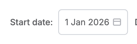
Value shape: date
Configuration:
variables:
  start_date:
    input: datepicker
    # Optional:
    default: "2024-01-01"
Usage:
queries:
  sales:
    sql: |
      SELECT * FROM dundersign.tickets
      WHERE {{ filter('created_at', start_date, '>=') }}
    source: my_postgres
daterange - Date Range Picker
Renders a date range picker for selecting start and end dates.
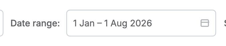
Value shape: date (returns object with start and end properties)
Configuration:
variables:
  date_range:
    input: daterange
    # Optional:
    default: ["2024-01-01", "2024-12-31"]
Usage:
Use the filter_date_range() macro for date ranges:
queries:
  sales:
    sql: |
      SELECT * FROM dundersign.tickets
      WHERE {{ filter_date_range('created_at', date_range) }}
    source: my_postgres
Or access start/end directly:
queries:
  sales:
    sql: |
      SELECT * FROM dundersign.tickets
      WHERE created_at >= '{{ date_range[0] }}'
        AND created_at <= '{{ date_range[1] }}'
    source: my_postgres
checkbox - Boolean Toggle
Renders a checkbox for boolean true/false values.
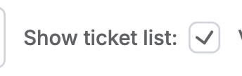
Value shape: boolean
Configuration:
variables:
  show_details:
    input: checkbox
    # Optional:
    default: false
    label: "Show Details"
Usage:
Commonly used for conditional rendering:
rows:
  - visible: show_details
    rows:
      - detail_chart
    # Chart only shown when checkbox is checked
radio - Radio Button Group
Renders a group of radio buttons for selecting one option from a small set.
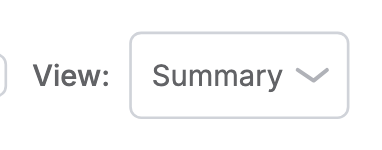
Note: radio currently renders as the same dropdown as select; there
is no dedicated radio-button widget in the variables strip yet.
Value shape: string
Configuration:
variables:
  view_type:
    input: radio
    options:
      static: [Summary, Detailed, Compact]
    # Optional:
    default: Summary
Best For: - Small sets of options (2-5 choices) - When you want all options visible at once - When the selection affects layout or display mode
Common Properties
All input types support these optional properties:
label
Override the auto-generated label (defaults to variable name):
variables:
  region:
    label: "Select Region"
    input: select
placeholder
Set placeholder text for text inputs:
variables:
  search:
    input: text
    placeholder: "Search products..."
default
Set the initial value before user interaction:
variables:
  region:
    input: select
    options:
      static: [North, South, East, West]
    default: North
Note: If no default is set, the variable starts as null/undefined. When used with the filter() macro, unset returns 1=1 (no filter applied). A non-required select like this one can always get back to that unset state via its menu's clear-selection row (see select - Single Choice Dropdown), without needing an authored option for it.
required
Block rendering until the variable has a value:
variables:
  region:
    input: select
    required: true
    options:
      static: [North, South, East, West]
Input Type Selection Guide
| Use Case | Recommended Input |
|---|---|
| Single selection from many options | select |
| Multiple selections | multiselect |
| Free-form text search | text / input |
| Long text input | textarea |
| Numeric value with constraints | number |
| Numeric value in a range | slider |
| Single date selection | datepicker |
| Date range selection | daterange |
| Boolean toggle | checkbox |
| Small set of mutually exclusive options | radio |
Related
- Variables – Basic variable setup and wiring
- Expressions – Using variables in queries and filters
- Advanced Variables – Dependent variables and conditional logic